Preramble
Today is launch day for ORBIT v2, the latest version of this site. Instead of just being a fresh coat of paint; we took this as an opportunity to demonstrate how we build accessibly and progressively for the web.
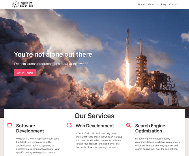
This change has been a long time coming. This site started life as a static Gatsby site in order to showcase our UX expertise, and technical prowess, with that frontend framework. Since inception, the site relied on the Bulma CSS framework—chosen because it can be authored in Sass. The site’s main goal, in the beginning, was as a playground for dabbling with specific technologies. A real-world sandbox to try out ideas/technologies, before using them on client projects.
That’s where the migration from Gatsby to Sveltekit began. We started using Sveltekit during the pre-release days (pre “1.0”) and were curious as to whether it would be a good fit for existing Gatsby projects that required ongoing maintenance. We believed at the time that Gatsby—though we loved it—was no longer the best fit for our clients’ needs. That old Gatsby site became the template of a new Sveltekit version. The goal was just to see if/how the Gatsby functionality could be replicated in Sveltekit. No new designs or major architectural changes, just lift from one framework to another. The move went well enough to justify using Sveltekit as the default framework for new client projects.
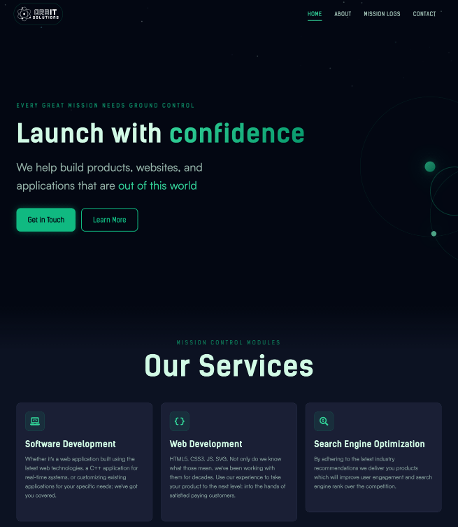
Meanwhile, this site is also the public face of our consulting business. This was fine because the site was clean and it worked, but we never really had the time to fully make it feel the way we wanted. We wanted a brand that better reflected ORB IT Solutions: bold, atmospheric, and forward-looking. Now we’ve finally taken the time to reflect this in the design. This is the story of how we went from a standard business site …
to an “Out of this World” space-faring experience.
The Mission Brief
The first step was to create a visual identity that was “tech-forward”, and leaned hard into the (existing) space exploration language and imagery.
To satisfy this design concept the “ORBIT” design system was created. It relied on 3 things:
- Dark Color Palette: using deep blues (
void-950) and vibrant greens (aurora-400). - Subtle animations: via components (
Starfield,OrbitalDecoration) and CSS transitons meant to evoke continuous cosmic motion of celestial bodies. - Bold Sans-Serif Typography: pairing Kelson Sans for heavy industrial headers and Satoshi for readability.
Designing the Palette
The actual color palette values emerged from conversations with Claude, with directions to generate a comprehensive Tailwind-compatible theme. The ability to interate quickly, and nail down a color palette we were happy with, was a key part of getting started. The AI-assisted approach allowed us to focus on applying the design system rather than getting lost in hex values and contrast calculations. Once that was started the rest quickly took shape into something that looked a bit like this:
@theme {
  /* Void - Deep Space Background Tones */
  --color-void-950: #030712;
  --color-void-900: #0f172a;
  --color-void-800: #1e293b;

  /* Aurora - Vibrant Accent Colors */
  --color-aurora-400: #34d399;
  --color-aurora-500: #10b981;
  --color-aurora-600: #059669;

  /* Nebula - Secondary Purple Accents */
  --color-nebula-500: #a78bfa;
  --color-nebula-600: #8b5cf6;
}
The Migration
This is easily the most boring part of this whole endeavor. Nevertheless, updating the underlying tech stack of the project needed to happen.
In the table below you’ll see the changes made between the old and new versions.
| Feature | Legacy Stack (v1) | OrbIT Stack (v2) |
|---|---|---|
| Framework | SvelteKit 2 + Svelte 4 | SvelteKit 2 + Svelte 5 |
| Styling | Bulma 0.9 + Sass | Tailwind CSS 4 |
| Linting | ESLint 8 (.eslintrc) | ESLint 9 (flat config) |
| Testing | Vitest 1 (jsdom) + MSW 1 | Vitest 4 (happy-dom) + MSW 2 + Playwright |
| Designing | None / Ad-hoc | Storybook 8 |
Adopting Tailwind CSS 4
Dropping Bulma for Tailwind 4 was not done on a whim. We had attempted an upgrade from Bulma 0.9 to 1.x. The changes seemed significant enough, that it was not going to be an easy lift. Having had a lot of experience with Tailwind 4 by this time we decided to try building on top of Tailwind, since styling with either Bulma 1 or Tailwind 4 would be a lot of work.
It helped that Tailwind was AI-friendly, while also being frontend developer friendly (if you like the CSS variable configuration system, which we did). This allowed us to define the theme in the app’s main css file, right where it’s used.
Progressive Enhancement
We upgraded to Svelte 5 for maintenance reasons and Tailwind for Developer Experience (DX) reasons. For the User Experience (UX) we wanted to ensure the site was functional even on a patchy space station connection—or with JS disabled. To that end we focused on Progressive Enhancement to improve the UX.
An example where this comes into play is our mobile navigation. Instead of relying entirely on JavaScript (JS) event listeners, we use the “Checkbox Hack” combined with Tailwind’s peer modifiers.
<!-- Header.svelte -->
<input
  type="checkbox"
  id="mobile-menu-toggle"
  class="peer hidden"
  aria-hidden="true"
/>

<nav class="... hidden peer-checked:block ...">
  <!-- Mobile Links -->
</nav>

<label
  for="mobile-menu-toggle"
  class="... cursor-pointer ..."
  aria-label="Toggle navigation"
>
  <!-- Hamburger Icon -->
</label>
This ensures that if the JS bundle fails to load/hydrate, mobile users can still open the menu and navigate the site. Reliability is part of our brand.
Testing for Launch
We didn’t want to break things while refactoring, so testing was a crucial ingredient.
1. Visual Testing with Storybook
We added Storybook which allowed us to test components like the Starfield and ContactForm in isolation. And plugins like addon-a11y enabled catching some contrast issues before they got to the site.
2. Testing with Vitest + MSW
For our contact form, we migrated to MSW 2.0 for mocking network requests. This allowed our tests to run quickly without depending on external APIs.
// ContactForm.test.ts
test('submits form successfully', async () => {
  server.use(
    http.post('*/api/contact', () => {
      return HttpResponse.json({ success: true });
    })
  );

  render(ContactForm);
  // ... interactions ...
  expect(await screen.findByText(/message received/i)).toBeInTheDocument();
});
Accessibility First
Throughout our development process we make accessibility (a11y) a first-class concern. We performed a11y checks at the end of each phase of development and resolved any issues we found. These included checks for:
- Color Contrast: We targeted important on-page elements to ensure they meet at least WCAG 2.1 AAA standards.
- Semantic HTML: We audited our heading hierarchy (
h1->h6) and replaced genericdivbuttons with proper<button>or<a>tags. - Progressive Enhancement: We made sure the mobile menu works with JS disabled, using CSS styles and HTML hacks to ensure navigation is always available.
- Reduced Motion: Since we introduced a lot of animations, the need to respect to user’s
prefers-reduced-motionsetting was now essential.
That level of care and thought isn’t just something we do for our own projects. It’s a core part of how we work: an example of what we do for our clients, and ultimately for their users as well. We want our clients’ work to reach as many people as possible, regardless of their abilities or limitations.
Redesign: Wrapped
It took quite a bit of coding to pull off this redesign. Compared to the pre-redesign master branch there were:
- 9,000+ lines of code added
- 5,000+ lines deleted
- 88 files changed

Liftoff
It took a while, but v2 now has a distinct personality that makes all the work done to get here worth it. Everything that we do from design, development, testing, a11y checks, automation or security is done with the user in mind.
This is how we ensure that we deliver great user experiences that are “out of this world”, as we work alongside you to launch your product with confidence.
Welcome to the new ORB IT Solutions! 🚀